Beverage Buds
Plant-focused hydration tracking

Overview
To create a means of both tracking and incentivizing healthy beverage consumption, I decided to prototype “Beverage Buds,” a platform that would center around watering plants that represent the user's daily hydration progress.
Role
Product Designer
Timeline
Spring 2023
Team
Sole Designer
Tools
Figma
The Problem
Staying hydrated is hard
From forgetting to fill a water bottle to seeking only caffeinated drinks, countless people often neglect proper hydration habits. Those who seek to create cleaner hydration habits often struggle to find the motivation to do so consistently. This led me to the question:
How can I design an engaging way to create healthy habits?
Understanding Users
How do people use similar platforms?
My goal was to examine and understand how users interact with a related existing interface. To do so, I found a water tracking app that contained the key elements I wanted in my design–a water intake interface and a hydration progress tracker.

Observations & Interviews
I observed and interviewed three of my peers using the app over a one week period. I focused on what features were serving user needs and how their hydration habits informed their app usage. My key findings are as follows:
Users considered the buttons too “blocky” & preferred buttons that were shaped as water droplets.
Most users struggled with daily water intake and felt that notifications were not enough to click on the app.
Personas

Users were overwhelmed by the amount of features and options available.
After organizing the information from my interviews and observations, I created two personas representing potential app users to guide my designs.
Dehydrated Danny is a college student who often finds himself forgetting to fill up his water bottle. He hopes to motivate himself to drink more water.

Hydrated Hallie is a fitness enthusiast who wants to to track the beverages she drinks. She wants a digital tool to help her maintain a healthy lifestyle.
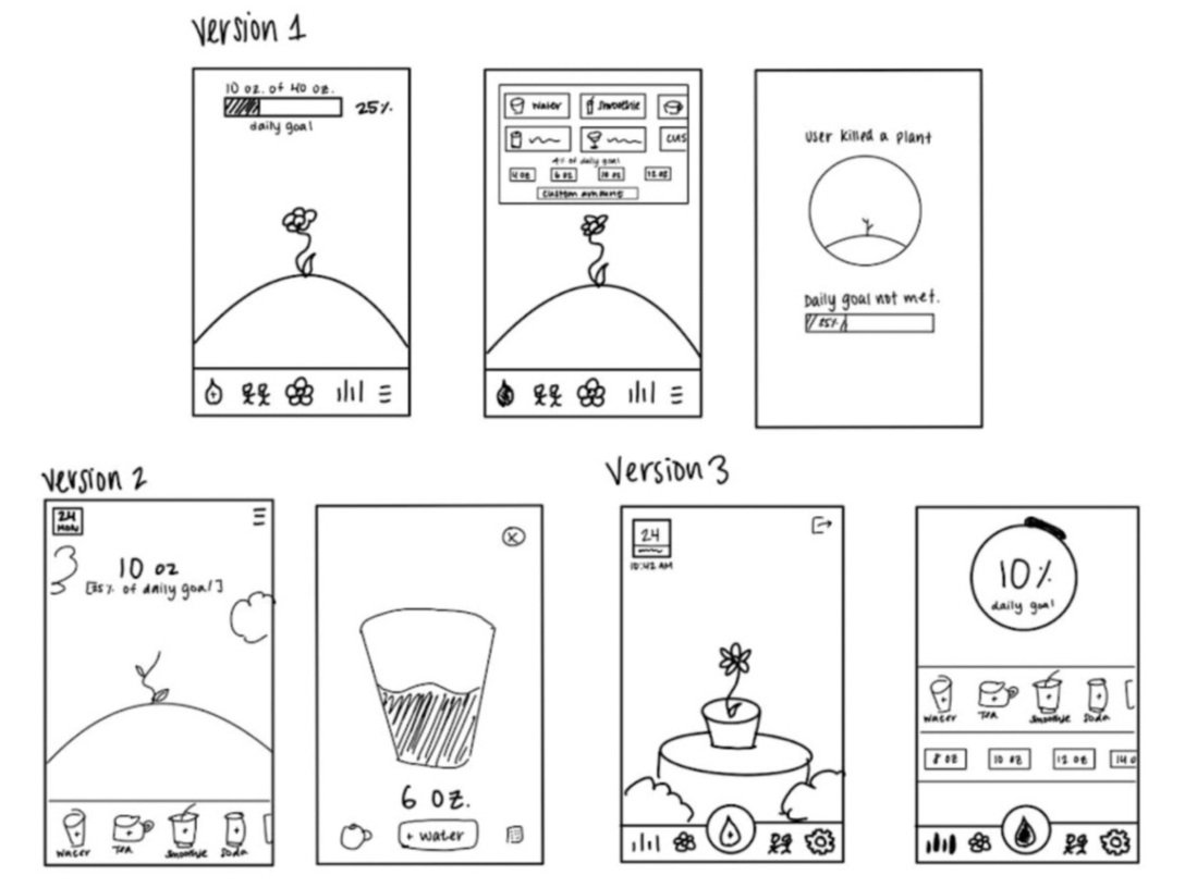
Initial Ideas
My next task was to create sketches for a home screen and an “adding drinks” screen. I sought to explore which layout most effectively communicated key pieces of information to the user.
*Version 1 includes a potential pop-up for if a user does not meet their hydration goal.
The Final Sketch
This final iteration was largely informed by a combination of which features were the most intuitive and aesthetically pleasing for users. With the user research in mind, I created my final sketch prioritizing the following principles:
A. Minimalist design: Users frequently cited busy layouts as a deterrent, so I prioritized simplicity
B. Strong Visual Hierarchy: I put the plant and progress tracker at the foreground of the layout to make the primary features clear

Visual Style Guide
Before diving into high-fidelity screens, I created a visual style guide to focus my design explorations:

To the Prototype!
My first iteration…
This version included screens to present different ways of viewing daily progress (% and oz) and a garden of flowers to represent an overview of a week’s progress.

Updating my designs
My second version incorporates three changes based on peer feedback:
The navigation bar was aligned to ensure the water drop was in the center and the icons were equidistant from each other.
The home icon was replaced with a flower and the settings icons with a wrench because the icons were too similar in the previous iteration.
A “User killed a plant” popup was added as an alternate path as I received feedback that it would be motivating.

User Testing
After prototyping the final screens, I conducted user testing to identify any issues with the app’s usability and interface. There were two main issues that users had:
Issue 1: Getting confirmation that they had successfully added their drink volume
Issue 2: Noticing changes with the flower growth after adding to their drink volume
Change 1: Creating a “Drink Added!” pop-up to create the second confirmation
Change 2: Animating the flower growing when users go back to the homepage
The Final Prototype
Takeaways
Throughout this case study, I expanded my understanding of how principles such as alignment, hierarchy, and proximity play key roles in usability. I sought to make sure these principles were at the forefront of each iteration I designed. I also learned just how vital user research is when creating effective design choices. Looking forward, I aim to continue reinforcing my understanding of design principles and centering human needs in my design thinking.