
Visions Magazine
Website for Brown & RISD’s AAPI literary magazine
Overview
VISIONS Magazine is Brown and RISD’s literary and visual arts magazine that highlights the voices of our Asian, Asian American, and Pacific Islander creatives. As Web Editor, I completely redesigned the website to reflect our new identity for the publication as we entered a new year.
Role
UX Designer
Timeline
Fall/Winter 2023
Team
Sole Designer
Tools
Figma, Squarespace
The Problem
We needed a site rebrand
This semester, the VISIONS editors-in-chief decided to completely rebrand the publication. The previous website did not align with the new identity and they sought a fresh, minimal site redesign that would help increase the reach of the pieces featured.
To uplift our AAPI creatives and grow our community, I asked:
How can I redesign the VISIONS site to reflect a new identity?

The previous website
Design Identity
Creating a new vision for VISIONS
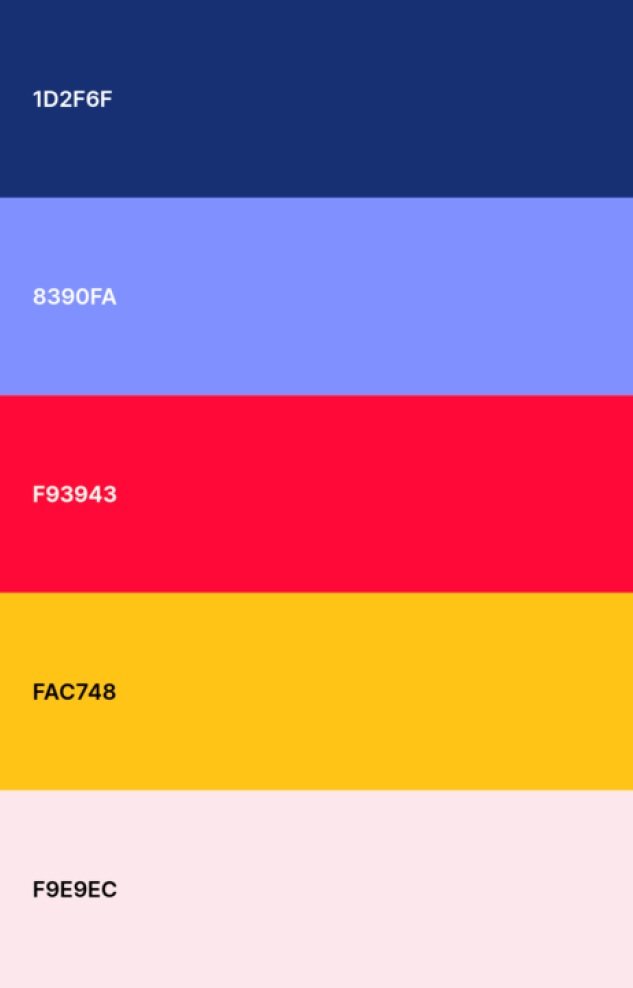
We wanted the website to be vibrant and playful—I decided to create a bright palette of colors that reflected the featured artwork. I worked alongside our graphic designer to create elements to populate the site to add visual interest while maintaining a clean visual identity.

Ideation
Prioritizing minimal designs!
Considering a need for a design that effectively highlights our artists’ works, I opted for a simpler layout. I sketched out a minimal home page before moving to wireframe in Figma.


Initial sketches

Figma wireframes

Iteration
Designing key screens
The two screens that underwent the most changes were the home page and extended pieces. I was unsatisfied with the lack of visual interest with my first designs (below) and reiterated to address this.

Onto iteration #2
I was more satisfied with these screens, but they still weren’t close enough to what I wanted.
✓
✘


✓
✘
unique and engaging layout
I then decided to diverge from my original sketches for a more unique landing page.
For extended pieces, I organized the layout by the most recent issue (fall ‘23) and past issues. I incorporated my more standardized cards from my first iteration to make them look more clickable—I aimed to organize the information effectively.
Getting closer… iteration #3
✓
✘
art more prominently featured, increased visual interest
landing page doesn’t incorporate branding, could be more creative
home page too crowded, extended pieces cards still do not look clickable due to variation
accessibility issues, cards do not look clickable, lack of visual hierarchy

better information architecture
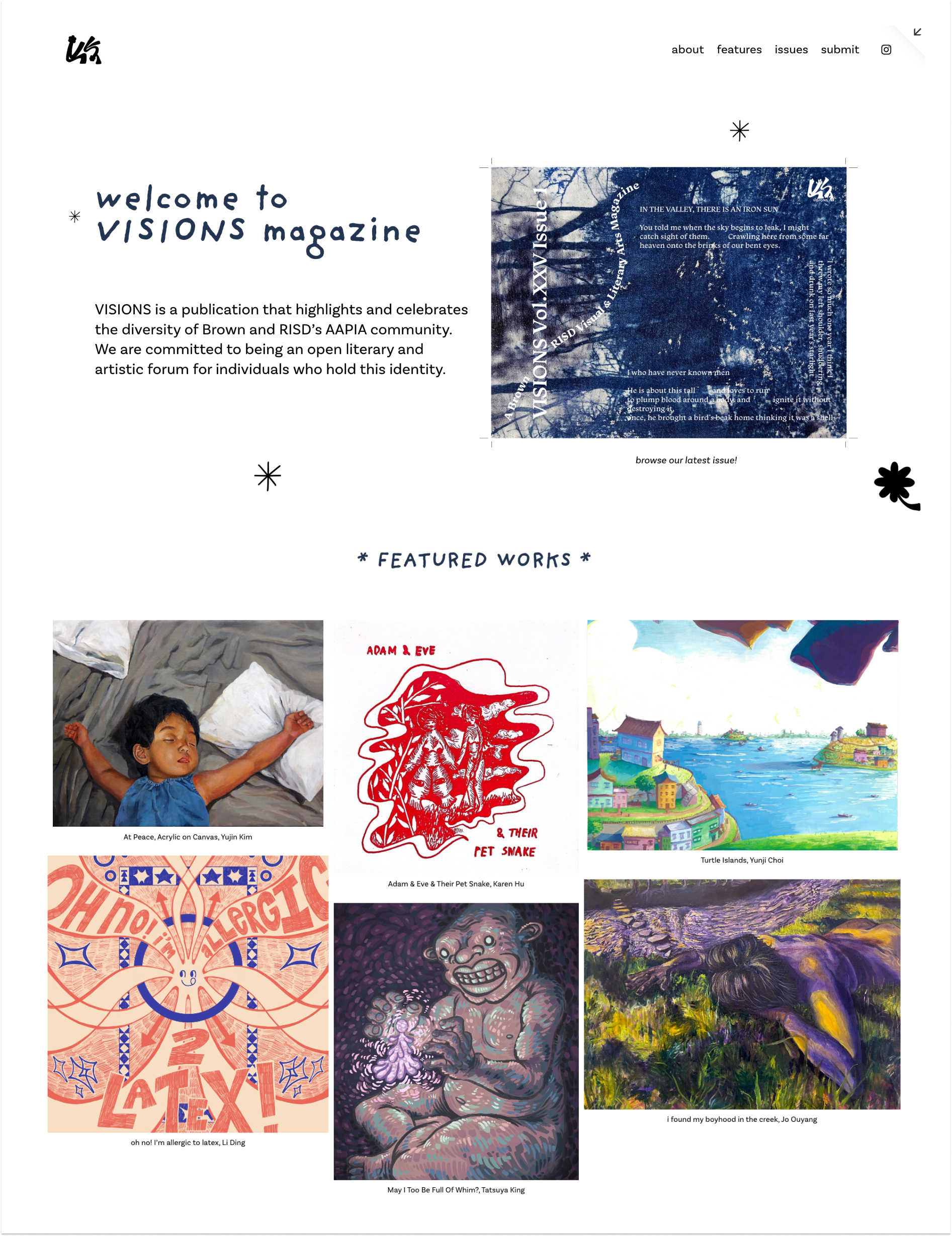
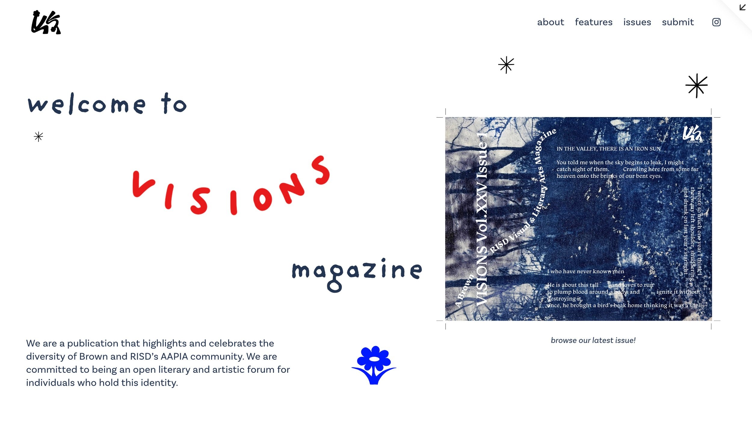
Final Designs
Dynamic landing page with featured pieces

Extended Pieces and Multimedia

About, Issues, and Submit

Reflections
This project was invaluable in teaching me how to maintain a minimalist layout while also valuing creative design and visual interest. Some next steps would be to:
Continue to improve the design of the extended pieces page to best display work
Redesigning the site with new colors and layouts to match next semester’s publication
Populating the page with even more work to spotlight the AAPI artist community!